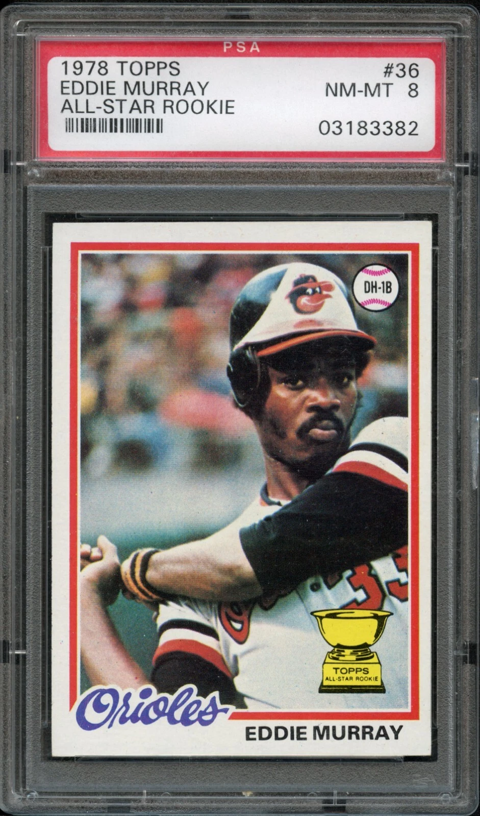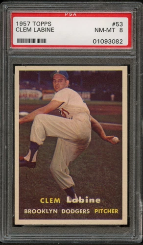
1957 Topps: photography in the standard format
The 407-card 1957 set uses the now-familiar 2½-by-3½-inch format and full-color photographs. Its rookie class includes Brooks Robinson, Frank Robinson and Don Drysdale. The comparatively spare design lets the photograph carry the card’s character, from posed portraits to broader field views.
Do not assume the highest-numbered cards are automatically the difficult series: the 265–352 range is an important collecting consideration. On an individual card, evaluate photograph quality, centering and the white borders separately. A sharp face can coexist with a crease, and a soft original image is not the same as surface wear.
1958 Topps: bold backgrounds and lettering
The 494-card 1958 issue uses cutout player images against solid-color backgrounds. Name lettering and the team treatment help create its unmistakable look. Certain early cards have yellow-letter and white-letter versions, so a variation collection requires more precision than simply recording the player and number.
The set includes Roger Maris and Orlando Cepeda rookies as well as Sport Magazine All-Star cards. Choose whether those special designs and lettering variants are separate goals or part of one master list. For a named lettering variety, insist on a legible front image; compressed group photographs are poor evidence of small color distinctions.
1959 Topps: circular portraits and a larger checklist
The 1959 issue grows to 572 cards. Circular player portraits, strong surrounding color and printed signatures give ordinary player cards their identity, while Rookie Stars, Baseball Thrills and other themed cards vary the rhythm of the checklist. Some portions have white- and gray-stock reverse distinctions.
Read the back before cataloging a variant and keep a photograph of the actual example. Do not confuse paper color with staining or a screen’s warm lighting. A clear scan under consistent light is especially helpful when comparing two copies whose front designs look identical.
Three designs, three inspection priorities
For 1957, begin with photograph clarity and the balance of the white borders. For 1958, inspect the uninterrupted color field around the player and the exact lettering. For 1959, check the circular image, printed signature and surrounding background, then confirm any reverse-stock attribution.
All three still require a full condition review. Corners, edges, creases, writing and lost paper do not disappear because the set has an attractive design. A holder photograph should show the whole card, and a reflection crossing the portrait is a reason to ask for a different angle.
A late-1950s collection with useful boundaries
A three-year player run makes the design transition easy to see. A team collection adds the changing roster, while a type collection can include one ordinary player card and one special-design card from each year. Verify the checklist before assuming every subject is available in every season.
For complete sets, maintain separate columns for basic numbers, optional variations and condition upgrades. Evaluate a partial set by its missing cards rather than its percentage. When comparing market examples, match the exact year and variety; shared subjects and identical dimensions do not make the cards equivalent.
Sources & further reading
Primary references for the terminology and factual details discussed above.
Explore the actual listings.
Read the item description, photographs, condition notes and terms on eBay. Selection and availability change.
Browse Current Sports Cards Inventory ↗Explore Graded & Vintage Baseball Cards ↗